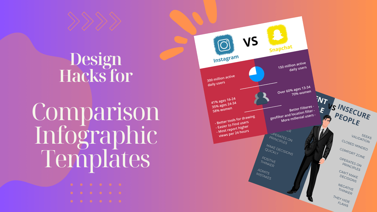
Comparison infographics are powerful tools for conveying complex information in a visually appealing manner. In a world inundated with data, the ability to present comparisons through compelling visuals has become crucial. Let’s delve into some design hacks for comparison infographics that can elevate the visual appeal of your templates.
In the vast ocean of information, comparison infographic templates act as beacons, guiding audiences through data with clarity and efficiency. Design plays a pivotal role in making these infographics not only informative but also visually engaging. As we explore design hacks, it’s essential to understand the significance of comparison infographics and how thoughtful design can enhance their impact.
Understanding Comparison Infographics
Definition and Purpose
Comparison infographics serve to juxtapose information, making it easier for viewers to grasp differences and similarities. Their purpose is to simplify complex data sets and enhance comprehension.
Effectiveness in Conveying Information
The visual nature of infographics aids in the efficient transmission of information. Studies show that people retain information better when presented in a visual format, making comparison infographics a potent communication tool.
Key Elements of Compelling Infographics
Clarity and Simplicity
The essence of a successful infographic lies in its simplicity. Clear, concise information presented in a straightforward manner ensures that the audience can quickly grasp the intended message.
Color Choices for User Engagement
Colors evoke emotions and play a crucial role in user engagement. A well-thought-out color scheme not only makes the infographic aesthetically pleasing but also enhances content comprehension.
Typography Considerations
Choosing the right fonts is vital for readability. Headings should be bold and easy to distinguish, while body text should be legible even at a glance.
Design Hacks for Comparison Infographics
Consistent Color Scheme
Maintain a cohesive color scheme throughout the infographic. Consistency fosters unity and helps guide the viewer’s eyes seamlessly from one point to another.
Eye-Catching Visuals and Icons
Incorporate visually appealing elements to break the monotony of text. Icons and illustrations not only add interest but also serve as visual cues for information.
Balancing Text and Images
Strike a harmonious balance between text and images. Avoid overwhelming the viewer with too much text, and use visuals strategically to reinforce key points.
The Power of Visual Contrast
Highlighting Differences
Visual contrast is a powerful tool for emphasizing differences. Use contrasting colors, shapes, or sizes to make distinctions stand out.
Techniques for Striking Visuals
Experiment with various design techniques to create visually striking infographics. Play with gradients, shadows, or overlays to add depth and dimension.
Typography Tricks for Infographic Design
Font Selection
Choose fonts that align with the overall theme and tone of the infographic. Headings can be bold and attention-grabbing, while body text should be easy to read.
Emphasizing Key Points
Leverage font variations, such as bold or italicized text, to emphasize key points. This helps guide the reader’s focus to critical information.
Layout Strategies for Impactful Infographics
Logical Content Arrangement
Arrange content in a logical flow, guiding the viewer through a seamless journey. A well-structured layout enhances the overall user experience.
Importance of White Space
Avoid clutter by incorporating white space. An uncluttered design allows the viewer to absorb information without feeling overwhelmed.
Data Presentation Techniques
Choosing the Right Chart
Select the appropriate chart or graph for the type of data being presented. Bar charts, pie charts, and line graphs each have their strengths in conveying specific information.
Tips for Organizing Data
Organize data logically, ensuring a natural progression. Group related information together and use visual cues to connect data points.
Mobile-Friendly Infographics
Responsive Design
Optimize your infographics for mobile users. Ensure that the design is responsive, providing a seamless experience across various devices.
Quality on Mobile Devices
Maintain high-quality visuals even on smaller screens. Prioritize clarity and legibility for users accessing the infographic on mobile devices.
Infographic Creation Tools
Overview of Popular Tools
Explore various infographic creation tools, such as Canva, Piktochart, or Adobe Spark. Each tool has its strengths, and the choice depends on individual preferences and requirements.
Pros and Cons
Understand the advantages and limitations of each tool. Consider factors like ease of use, available templates, and customization options.
Common Mistakes to Avoid
Overcrowding
One common pitfall is overcrowding infographics with unnecessary information. Keep it concise, focusing on the most relevant points to prevent overwhelming the viewer.
Ignoring Accessibility
Ensure your infographic is accessible to all users, including those with disabilities. Provide alternative text for images and use readable fonts and colors.
Case Studies: Successful Comparison Infographics
Real-World Examples
Explore case studies of successful comparison infographics. Analyze what makes them effective and apply those principles
Lessons from Success
Extract valuable lessons from real-world successes. Understand how effective design contributes to the impact of the infographic.
DIY Infographic Design Tips
Encouraging Creativity
Empower readers to try their hand at creating infographics. Share resources and tutorials to nurture their infographic design skills.
Online Learning Resources
Point readers to online platforms where they can learn more about infographic design. Platforms like Skillshare or Udemy offer courses suitable for beginners and advanced learners.
Trends in Comparison Infographics
Staying Updated
Design trends evolve, and it’s essential to stay updated. Explore the latest trends in infographic design to keep your creations fresh and appealing.
Evolving Aesthetics
Witness the changing aesthetics of infographics. Adapt your design approach to align with current trends without compromising on the clarity of your message.
Conclusion
In conclusion, the visual appeal of comparison infographics is paramount in ensuring effective communication. By implementing design hacks, such as consistent color schemes, visual contrast, and thoughtful typography, you can elevate the impact of your infographics. Remember, a well-designed infographic not only conveys information but also captivates and engages the audience.


